Compliance data carries real money and legal risk, and it’s read by executives on a laptop between meetings as much as by contractors on site. Accessibility was a requirement from the first wireframe, not a final check.
Status in words, not just colour
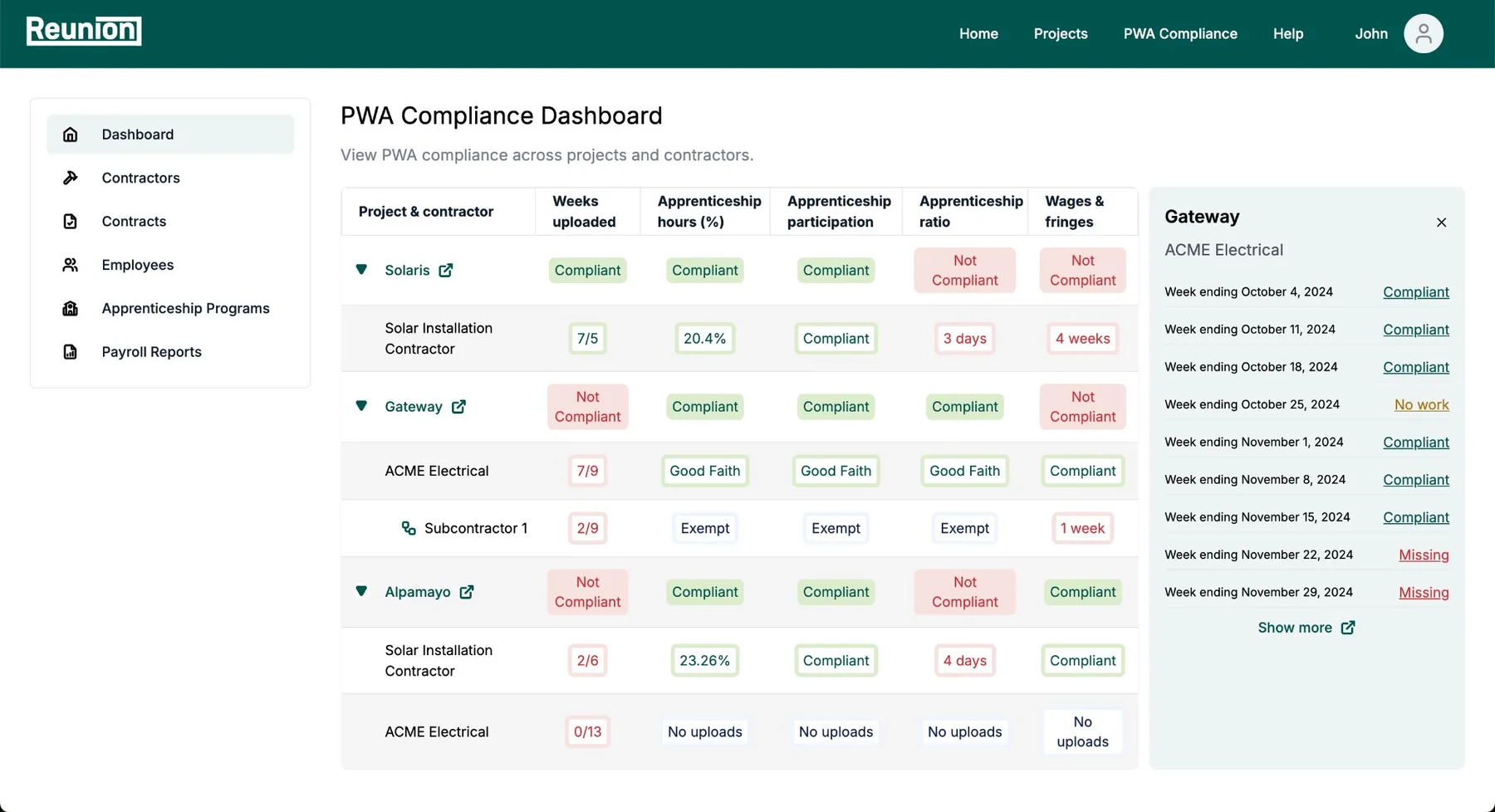
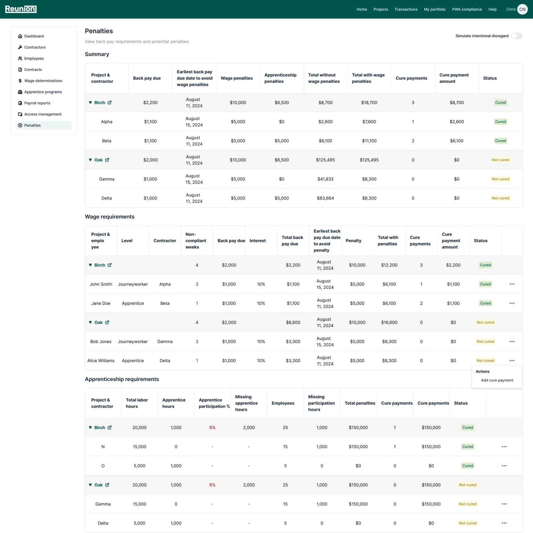
Every status is written out: Compliant, Not compliant, Good Faith, Exempt, Missing. People with colour blindness, or anyone printing a report, never has to rely on red and green.
High contrast, readable data
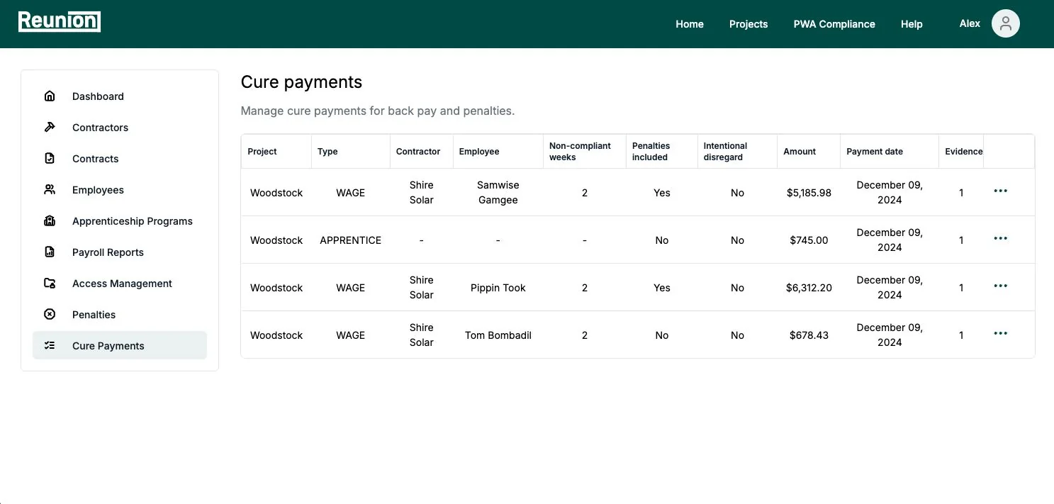
Dark text on light backgrounds, a restrained palette and clear column headers keep dense compliance tables easy to scan and meet contrast guidelines.
Forms that explain themselves
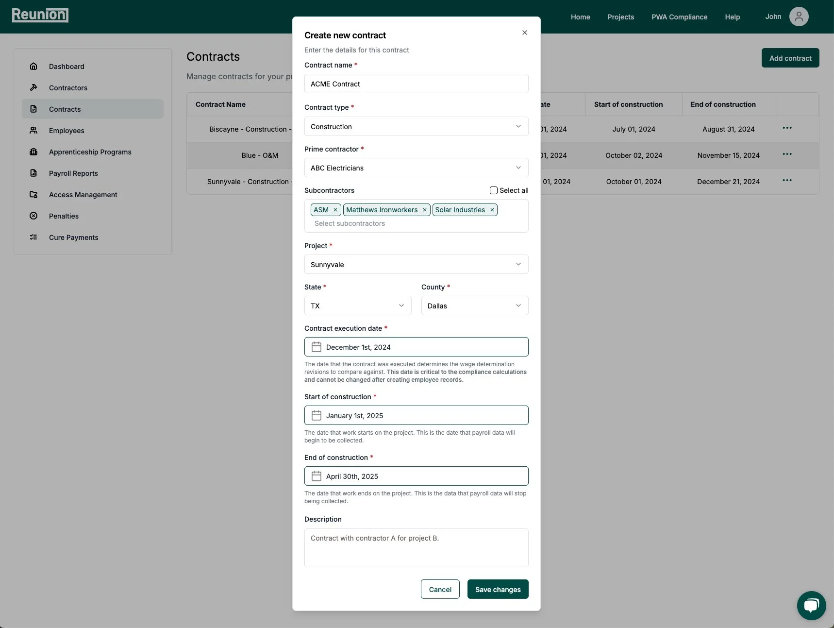
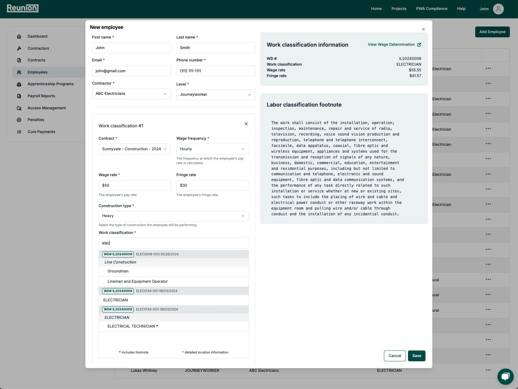
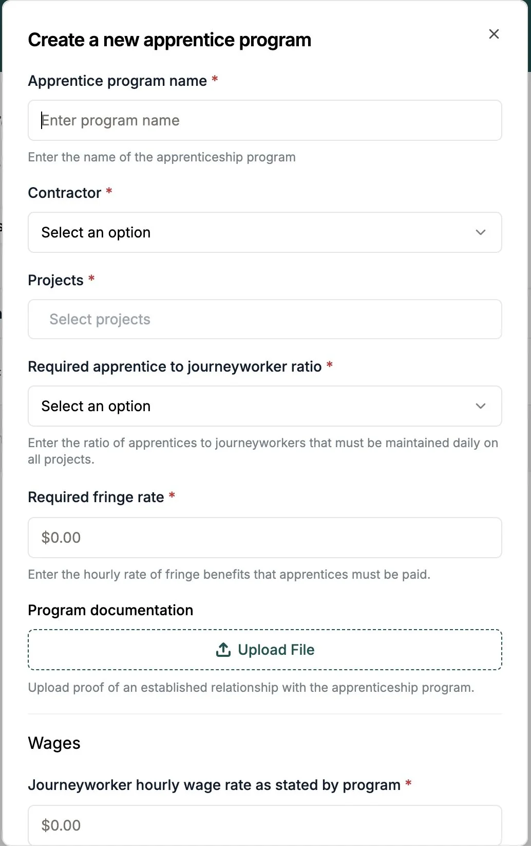
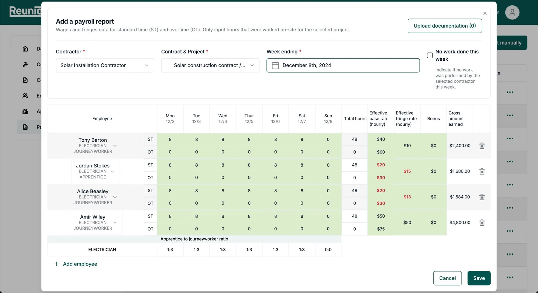
Every field has a visible label, required fields are marked, and plain-language helper text explains terms like journeyworker ratio or contract execution date.
Plain language for the boardroom
Regulatory detail is turned into answers executives can act on: is this project compliant, what’s at risk, and what does it cost to fix.
Keyboard-friendly workflows
Forms, tables and dialogs follow a logical order with visible focus, so heavy data entry like payroll reports works without a mouse.
Consistent, predictable layout
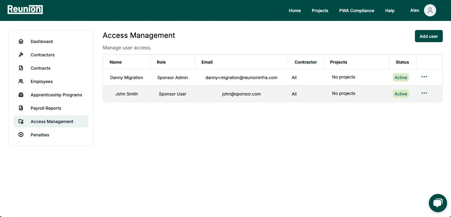
The same navigation, page structure and actions on every screen, so the product is easy to learn for occasional users and those using assistive technology.